
Testimonials that Deliver Customers
Are too many of your potential customers scared to buy from you? Are you frustrated that you’re getting decent traffic to your website but your visitors seem reluctant to purchase from you or even contact you?
It may be time to have a look at your testimonials.
It’s no secret that the opinions of others matters to us. Psychologists and marketers know and utilize this principle of “social proof.”
And that’s why the right testimonials need to be a part of your marketing.
They are powerful.
90% Of Customers Say Buying Decisions Are Influenced By Online Reviews
Marketing Land
When a prospective client reads, watches, or listens to your testimonials, it’s like somebody’s whispering over their shoulder, “trust me…I felt like you…it’s gonna’ be all right.”
Their fear is fair. They don’t know you. Not yet.
And yes, you may be incredible. You may deliver the most fantastic product or service.
In fact, you may be EXACTLY what your future customer is looking for.
But they need some help to get there. And testimonials, done right, can move that needle in the right direction.
It’s especially important in the online world – where your customer may not be able to walk into your store or visit one of your locations because you’re half way around the world.
The research is pretty clear:
Customer testimonials have the highest effectiveness rating for all types of content marketing, with a rating of 89%.
Don’t forget, there’s a natural fear of the unknown. It’s part of our DNA. It’s one of the reasons we reference the behavior of others.
This practice has kept us safe and allowed us to survive and prosper…not only on the school playground, but as consumers.
Customer testimonials soften the fear that most of us have. Remember, buying is an emotional decision at its core.
So does that mean you shouldn’t be self-promotional?
Not at all. Tell your prospects you’re great. Absolutely. Be proud of who you are and what you stand for.
But make no mistake about it, another person’s positive perception of you holds more credibility than any other marketing message because:
- There is trust.
- There is an implied impartiality in a third party opinion.
They love you…other’s love you. Yup, you are the real deal!
Testimonial examples – why one size does not fit all
The prevailing and often contradictory wisdom surrounding client testimonials, is that there are hard and fast rules you MUST follow in order to successfully utilize this social currency, like:
– client testimonials need to be as specific as possible
– client testimonials should use relevant numbers
– a customer testimonial that is short and simple is best
– customer testimonials with longer stories convert better
In our experience, you need to test which kinds of customer testimonials work best for you in specific ways.
In some cases, a couple of effective sentences will perform well.
Sometimes, a story works best.
Over time, as you gather more and more testimonials, you need to test which kinds and combinations work best for you in your market.
Faces add elements of trust to testimonial examples
Real faces, real names, and company names add authenticity.
Without these trust signals, the customer testimonial is weaker.
While some industries necessitate privacy for obvious reasons, the optimal choice is to go with authentic details and a picture.
A picture will enhance the persuasiveness of honest reviews.
Video testimonials can pack a punch
Seeing a customer on-screen makes his or her statement even more credible.

If securing this type of customer testimonial is possible for you, then make it a priority. It will pay dividends. And don’t worry too much about production levels for this type of video (but do make sure the sound is decent).
Customer video testimonials feel real because they are. If a picture is worth a thousand words, then, according to Dr. James McQuivey of Forrester Research, a minute of video is worth 1.8 million words.
When a visitor lands on one of our landing pages with a video testimonial like the one above, they are 188% more likely to convert into a lead.
There are so many elements about client video testimonials that work in your favour that I could dedicate an entire post to that. But briefly, here are a few points to chew on:
- Video is the most shared brand content on Facebook (Zuum)
- A study by Comscore found that, on average, a website visitor will stay two minutes longer on a site when they watch a video.
- When we see “real” people talking…it adds a personal and human level to what can sometimes be a very impersonal online world.
QUICK TIP
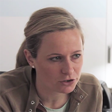
A great time for an improvised video testimonial is when you’re meeting with clients or reviewing how a project went. That’s how we collected this very under-produced video testimonial you see above.
Webcam testimonials can add an element of authenticity
Sometimes, circumstance (distance, convenience, time) restrict our ability to capture a video testimonial in an ideal face-to-face environment.
Don’t worry. Nobody is expecting Steven Speilberg. Do the best you can within your given situation.
Almost everyone has a webcam or a smartphone with video options. This can add to the “realness” of the video. It can even add a little charm.
This webcam testimonial here, hit on a lot of the necessary elements of a great testimonial:
- industry context, within the use of the client’s product
- a recognized leader within the target community
- the under-produced nature of the video lends to the “realness” of the story

Encourage reviews & consider Google trusted 3rd party reviews
If you have an ecommerce site, you need to make it as easy as possible to leave a review. And make sure you place them where they can’t be missed.
This website here uses an approved third party service for collecting reviews and syndicating them to sites like Google.
Why pay to use a 3rd party independent reviewer?
We’ve all heard stories about fake reviews. The fact that these reviews are verified may create more confidence in your website visitor.
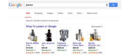
And “approved by Google” means your reviews can show up in product searches like the one shown below. This can be a critical step in performing well if you have a Google merchant account for your ecommerce site.
Customer testimonials need to be part of your processes
If you don’t have a process for collecting customer testimonials you’re hurting your current and future business.
If you know and believe what you do is good, then the world needs to know that. And hopefully, we’ve already established that hearing it from your customers and clients is the best way.
Feel like you’re begging when asking for client testimonials? Don’t! Here’s how:

Ask for feedback, and don’t use the word “testimonial” if it has baggage for you. Keep in mind, feedback can be structured. And that takes the pressure off you and your customers.
Asking customers the specific question, “can you give me a testimonial?” can often trigger the deer in the headlights look.
Not because they don’t value you or your service. But because you’re not giving them any real context and direction. You’re asking them to be creative. They may not be.
Feedback takes you out of that loop and provides you with a structured way to get:
- Honest comments about your company and what you do.
- More context about how your product or service fits into the big picture for your client.
- Details from this evaluation that could positively relate to other similar prospects.
A testimonials page, or throughout your site?
It used to be common practice to have a single dedicated client testimonials page at your website.
While this is still important in some niches, testing can show us that having testimonials at key locations of your website can have more of an overall impact.
Client testimonial placement can drastically affect your conversions. Heatmap tracking at this client site showed us that testimonials were not getting enough action where they were on the page, so we moved them to a different place and got the results we needed.
You know how important social proof is, so don’t make your customers hunt for a testimonial.
Great places to test customer testimonial placement include:
- On your homepage above the fold.
- Near your sign up form.
- In your sidebar.
- On your product page.
- On your landing pages.
When to ask for customer testimonials?
Sometimes clients feel that their customer testimonials should just happen naturally and organically. And while that does happen on occasion, it’s not a realistic approach for such a vital part of your marketing.
Ideally, for reviews, you want to ask customers when they’re happiest about what you’ve offered them, which is usually when the experience is fresh.
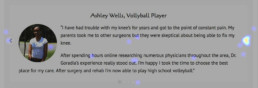
This online home insurance provider here asks for testimonials right after their product is purchased. That’s enabled them to incorporate a staggering number of positive reviews in a traditionally conservative industry that struggles in this area.
Some products or services require more time to deliver outcomes, so in those situations, you’ll want to be mindful of those timelines.
Conclusion
Customer testimonials and reviews can be a difference-maker in your business, as long as you use them the right way.
Take the time to create a process that allows you to gather and make the most of them.
Get more website traffic & leads with our proven approach to digital sales and marketing.
Get more website traffic & leads with our proven approach to digital sales and marketing.
Get more website traffic & leads with our proven approach to digital sales and marketing.
Get more website traffic & leads with our proven approach to digital sales and marketing.

Is Your Website Design Hurting You?
Is Your Website Design Hurting You?
Is your website underperforming? Or worse, making you look like an amateur?
It could very well be your website design.
Fair or not, your prospects judge you by your website design.
The research is clear – potential customers are visiting your website and judging your business based on what they see.
75% of people judge the credibility of a company based on the design of its website
Stanford University
If your visitors like what they see, then they stay. Consume your content.
Engage and interact with your site.
And if you’ve planned out an effective sales funnel, they then become your new customers.
If they don’t like what they see – they quickly CLICK AWAY.
Gone forever. Off to your competition.
Ouch!
Of course, snap judgments aren’t breaking news. You and I do it everyday.
The fact is, we’re genetically hardwired to make split-second decisions.
So how much time does your website have… so potential customers dig deeper?
50 milliseconds (source).
Gulp.
Your website only has 0.05 seconds to make a good first impression.
Blame evolution for our ability to make judgements in the blink of an eye.
Great for when a big scary animal could eat us.
A different challenge when you’re trying to get potential customers to give you a shot at their business.
So how can you make the most of these 0.05 seconds? No pressure, right?
A good start, is by knowing how the brain creates shortcuts based on expectations.
Science calls these expectations “prototypical elements.”
In the case of your website, there are a number of prototypical elements your website visitors expect to see. Here are only a few:
- clear and intuitive navigation (the #1 design complaint about websites is difficult navigation)
- site copy that is easy-to-read and adds clarity to their overall experience
- a check-out in the top right corner (if you’re an ecommerce site)
- trust-building elements, like customer testimonials or reviews
When your website doesn’t conform to their expectations, it’s harder for your customer.
And harder is typically bad for sales.
When the worst happens, your potential customers will judge your website as either too confusing or poorly designed.
And leave.
Again, in the blink of an eye.
Beautiful design wins - and you get more customers

Like me, you probably noticed the red hat immediately. Your eyes might have been drawn to the arms, as they provide a kind of a frame for the hat…and if you took a deeper look, you may have followed the direction the woman is looking, with your eyes moving up her legs to her feet.
Then, to the contrast of the blue water, slightly lapping against the woman’s legs. Then, to the darker blue in the shape of a person’s shadow (presumably a man) looking toward the woman.
Clarity of focus and simplicity are prized design elements. And for good reason. Effective visual design can create a story worthy of your brand.
A compelling emotional connection.
A connection that the research supports. According to this Google study, website visitors consistently rated visually simple websites as more beautiful.
And the opposite is true – when the visual complexity of your website is high, your potential customers perceive it as less beautiful.
SIMPLE = BEAUTIFUL.
Even with layouts that had a high level of familiarity, simplicity and beauty won the day.
And beauty converts better.
As Steve Jobs famously said:
Simple can be harder than complex: You have to work hard to get your thinking clean to make it simple. But it’s worth it in the end because once you get there, you can move mountains.
Today more than ever, companies rely on their website to communicate who they are to their potential customers.
To develop that important emotional connection.
Don’t forget, your website is often the first face your customers will see. The first point of contact.
If that’s not to your benefit, it’s critical you change that.
The good news, is that research-based and field-tested web design practices allow you to make a strong first impression. And those same practices allow you to shape the customer journey.
To lead your potential customer down the path to increased conversions.
And that means more paying customers.
It’s part art, and a whole lot of science.
The science and psychology of effective web design

The research and science of website design has become more and more sophisticated. And it’s impact on consumer purchasing behavior can now be measured.
And that makes it a valuable tool in your marketing.
So, in a world where today’s consumer has almost limitless options…all within the click of a mouse, where’s a good place to start?
Not surprisingly, attention is one of “the” critical elements to success.
When visitors come to your website, grab and keep their attention.
The emotional brain (which has a huge impact on our decisions) is affected by pictures. So use them to your advantage.
Especially pictures of people.
Used correctly, they are one of many tools that can help your visitors focus. And focus reduces friction.
That helps buyers buy from you.
As Victoria Young puts it:
Today, the most successful digital experiences have emerged out of focusing on reducing friction in the user journey.
And what exactly is friction at your website?
Anything that makes life too difficult for your visitor.
In user experience, friction is defined as “interactions that inhibit people from intuitively and painlessly achieving their goals.”
Friction is normally bad because it reduces conversions, and frustrates potential customers to the point of abandoning their tasks.
In other words, don’t make your website visitor work too hard.
Visitors will do the least amount of work possible to get a task done – like buy your product.
An example of page scanning patterns
Well known eye-tracking studies like this and this show us how users view website content and how visual relationships affect their focus on the page.
With attention at a premium, it’s critical that every element on a page adds value to your visitor.
Of course, a large number of elements influence the visual design of your site. Here are only a few:
- font selection
- white space
- contrast
- size
- color
When we utilize any of these elements in purposeful ways, we need to consider how they impact our visitor.
And we need to remember that web surfers skim.
We hunt and peck.
Seeking out information that’s relevant.
And most of the time…disregarding information that isn’t.
When we work within this framework, we can create page design patterns that work for your customers.
And ultimately, help your business grow.
Designing your website for your users requires testing

Making informed choices and improving visual design—including layout, color, graphics, and text choice – is a process.
When done well, your website becomes your top salesperson.
Generating leads.
And revenue.
24 hours a day, seven days a week.
It’s begins with a clear understanding of design principles and human psychology, in the context of clearly defined business goals.
It is refined through testing.
And more testing.
And still more testing.As user experience expert Jeff Horvath says here:
A good user experience, like a measurable ROI, doesn’t typically happen by accident. It takes careful planning, analysis, investment, and continuous improvement.
Conclusion
Bad design can be frustrating and inconvenient. And it can hurt your business.
Because your visitors determine the success of your website, they should be the focus of your research and design.
Naturally, understanding the principles of design is critical. And knowing what rules can be broken and how they can be applied effectively takes context that comes with experience.
But make no mistake, testing is a key part of the web design process.
Effective design – and one that improves your bottom line – is about researching what makes your buyers buy from you. And then delivering that message in a visually beautiful and engaging way.